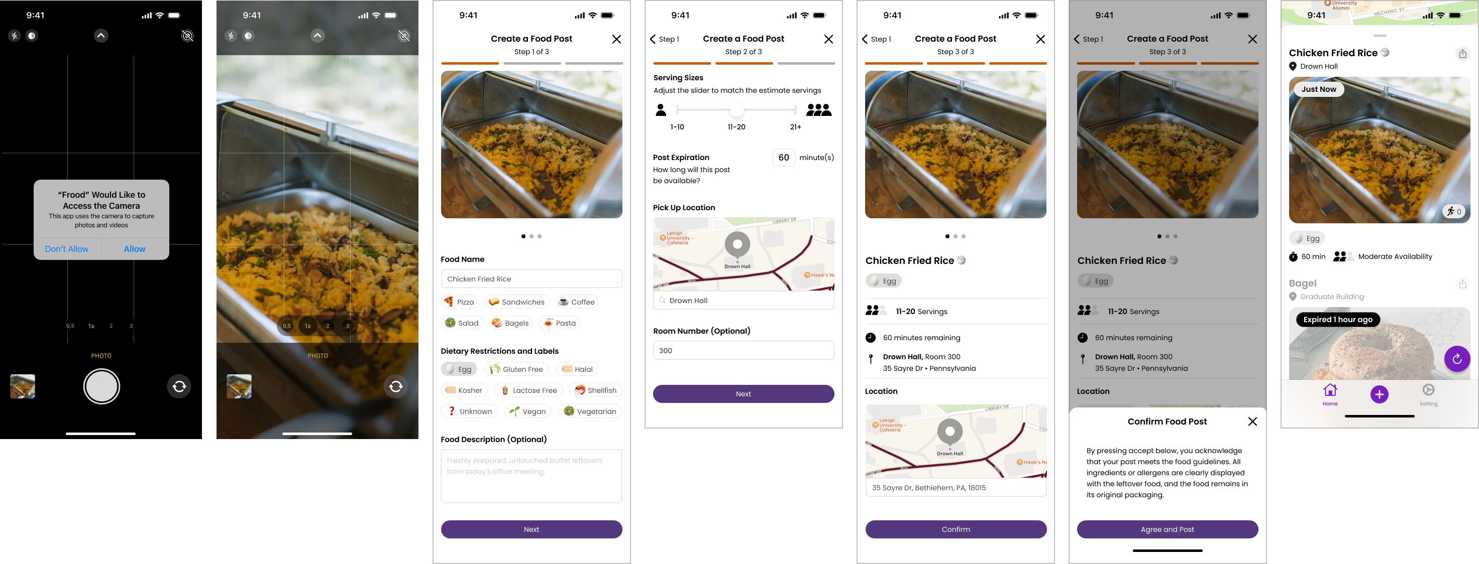
Frood: Create a Food Post
Year
November 2023 – Present
Disciplines
UI/UX Design, User Researcher, Content Writing
Role
Founding Designer
Tools Used
Figma, Illustrator, Photoshop, Power Automate, Power BI
User's Pain Points
Exclusive Branding
The branding was too closely tied to the founding university, making it feel exclusive and unwelcoming to users outside that community.
Outdated Design
The interface lacked modern visual appeal and usability, making the user experience less intuitive and engaging.
Lack of Key Food Details
Users couldn’t specify dietary restrictions or serving sizes, making it difficult to determine if the food was suitable or still available.
No Clear Preview Option
Users could not see how their food posts would appear before publishing, leading to confusion and incomplete posts.
Business Problem
Hindering Growth/User Engagement
The difficult posting process made it hard to keep and attract new users, which hurt regular use of the app.
Limiting Competitive Edge & Scalability
The design flaws made it hard for Frood to grow and build a community focused on sharing food sustainably.
Competitive Insights
To better understand how successful food-sharing and delivery apps handle similar challenges, I conducted competitive insights:
The insights from these platforms informed my decision to focus on simplicity, visual clarity, and a streamlined process that would encourage users to quickly and confidently create posts.
Adding Mandatory Fields
Pain Point: Limited Functionality & Overcomplicated/Unclear Input Fields
- Introduced dietary restriction and serving size tags, allowing users to clearly specify food details.
- Used icons and labels to guide users through required and optional fields.
- Added an optional food description field for additional details like pick-up instructions.
Confirmation Screen
Pain Point: No Clear Preview Option
- Created a confirmation screen as an additional verification step, allowing users to preview their posts before publishing to ensure all details are correct.
- Added a popup with posting guidelines that users must agree to before submitting.


